
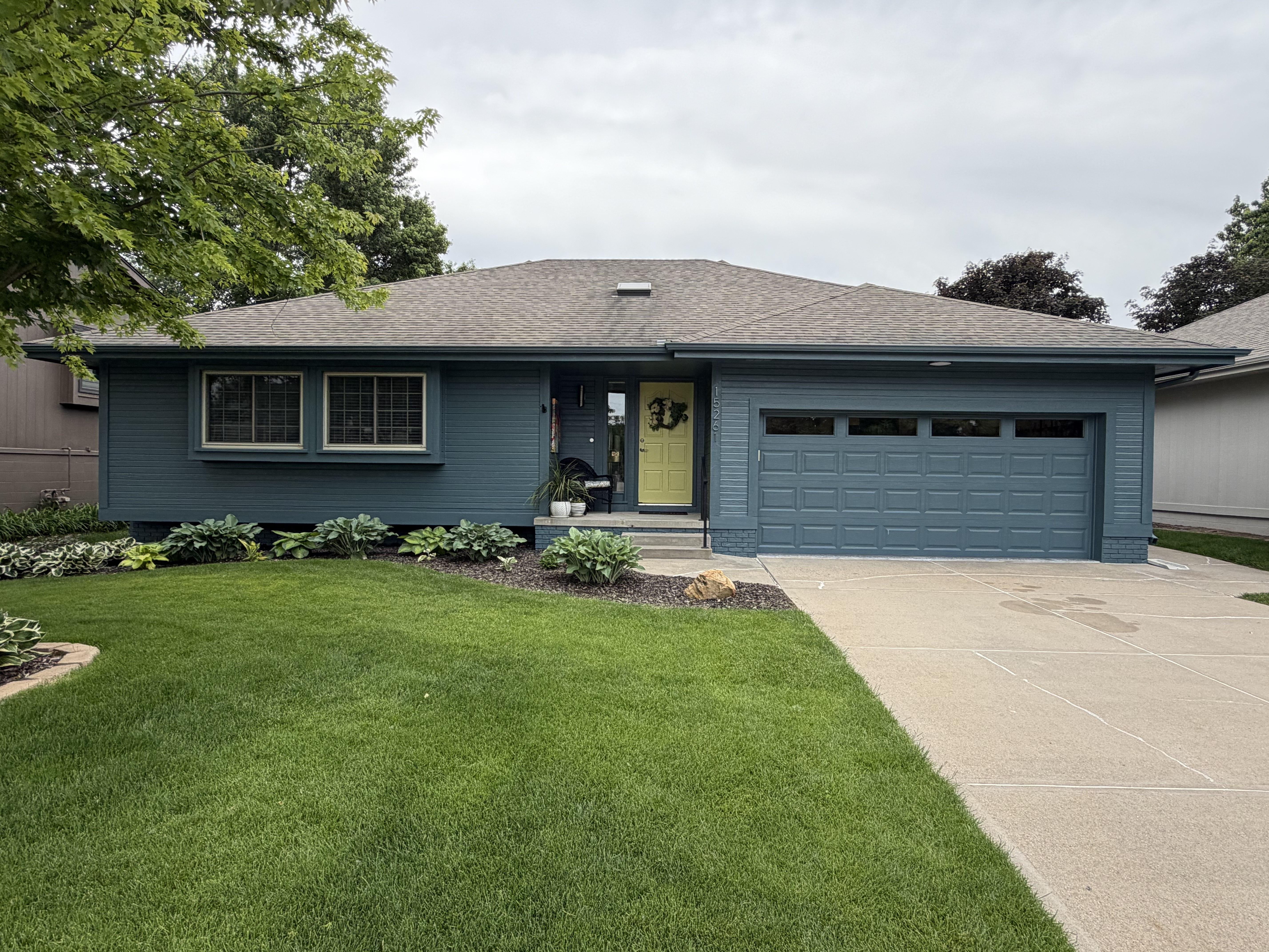
Warm Earth Tones Paint Colors in Omaha, NE
Cozy, grounded colors inspired by clay, terracotta, and natural wood.
Get Your Free Quote
Tell us about your project. We respond within one business day.
Working With Warm Earth Tones
Warm earth tones bring comfort and character to a space. Think sandy tans, clay, olive, and warm browns that feel natural, inviting, and grounded.
These colors shine in living rooms, dens, and exteriors where you want a welcoming, established feel. They pair especially well with wood and natural materials.
Earth tones have a long history in the Omaha metro, where brick, stone, and mature trees already set a warm, established backdrop. Clay, ochre, and olive feel at home against that context in a way cooler colors sometimes fight, which is why they read as timeless rather than trendy on both interiors and exteriors here. When a palette echoes what is already outside the window, a house tends to look like it belongs on its street.
Light is the make-or-break factor with this family. Because saturated warm colors absorb rather than reflect light, they can feel cozy and enveloping in a sunny room and heavy or muddy in a darker one. We always test earth tones in the specific room they are headed for, and we often pair a deeper clay or olive with generous neutral space and bright trim so the color feels intentional instead of closing the room in.
These tones are also forgiving in the ways that matter for daily life. Sandy tans and warm greiges hide the scuffs, dust, and hand marks that show up fast in entryways, hallways, and family rooms, so a busy household still looks put together between cleanings. That practicality, combined with their natural warmth, makes earth tones a favorite for the hardest-working spaces in a home.
Where earth tones really come alive is in combination with real materials. Terracotta against cream trim, olive cabinets next to brass and walnut, warm brown siding beside natural stone, these pairings lean into texture and let the color feel layered rather than flat. We help you build the palette around the wood, tile, and metal finishes you already love so everything looks collected over time instead of matched from a single chip.
The Palette
Clay Terracotta
#B5714E
Warm Sand
#C9AE86
Olive Grove
#7C7A57
Toasted Almond
#B79B7B
Weathered Brick
#9E5C48
Golden Ochre
#C08A3E
How to Pair It
- Pair terracotta with cream trim for a Southwestern warmth
- Ground olive and sand with charcoal accents
- Use warm woods and brass fixtures to complete the palette
How to Choose
- Consider the amount of natural light, since earth tones read darker in low light
- Balance saturated tones with plenty of neutral space
- Test against your wood floors and cabinetry undertones
Living With Warm Earth Tones
A color you love in a magazine and a color you love to live with are not always the same thing. Warm Earth Tones tends to reward homeowners who think past the first impression and consider how the space actually gets used, where the sun lands in the afternoon, which rooms feel busy versus calm, and how the palette will hold up as furniture and seasons change around it. The best schemes still feel right a year later, not just on the day the last coat dries.
We also think about maintenance when we help you choose. Part of our job is matching the color you want to a finish and a surface that will keep it looking intentional through real family life, so the palette works with your home, not against it.
Lighter Tones
Keep rooms feeling open, bright, and larger, but they show scuffs and hand marks sooner in high-traffic areas like halls, stairwells, and mudrooms.
Deeper, Richer Tones
Hide daily wear and add drama and coziness, but they demand cleaner prep and steadier application, because every flaw shows under a saturated color.
Light & Undertones
The two reasons a paint color surprises people almost always come down to the light it lives in and the undertone hiding inside it. Here is what we account for before you commit to a warm earth tones shade.
Which Way the Room Faces
North-facing rooms cast a cooler, bluish light that can make warm tones read muddy and cool tones read crisp. South-facing rooms flood with warm light that intensifies everything. The same warm earth tones shade can look like two different colors in two rooms of the same house.
The Bulbs You Live Under
Warm versus daylight LEDs shift a color dramatically after the sun goes down. We look at a swatch under your actual fixtures, not just a showroom, so the shade you approve is the shade you see at dinner, not a surprise.
The Undertone Underneath
Almost every color carries a subtle bias that only reveals itself next to your fixed finishes, flooring, countertops, tile, and trim. Miss the undertone and an otherwise perfect color can clash with everything already in the room.
This is why we sample on your walls before committing. It costs a little time up front and saves you from the far more expensive experience of repainting a room that never looked the way you pictured it. When in doubt, we would always rather test than guess.
Warm Earth Tones FAQ
The questions we hear most when homeowners are deciding on a palette. Still stuck? Every project includes a color consultation, so you never have to commit alone. We will bring samples, look at them in your actual light, and talk through how each option plays with the furniture, flooring, and trim you already own, turning a decision that feels overwhelming into a short, confident conversation you walk away from sure of your choice.
How do I test a warm earth tones color before committing?
The single best thing you can do is put real paint on your actual walls, not just hold a chip up to them. We recommend sampling a couple of finalists in a two-foot square on more than one wall, then living with them for a few days. Look at each swatch in the morning, in the afternoon, and at night under your own light bulbs, because the same shade shifts noticeably as the light changes. A tiny chip under showroom lighting almost never tells the true story, and this small step routinely saves people from repainting an entire room.
How many colors should I use in one home?
Most homes feel cohesive with a tight palette: a main wall color, a trim color, and one or two accents used intentionally. Within the warm earth tones family that is easy to pull off because the tones are designed to relate to one another. Flowing one primary color through connected spaces keeps an open floor plan calm and makes rooms feel larger, while a bolder accent earns its impact by being used sparingly. We will help you decide where to hold steady and where a change of color actually adds something.
Will these colors look dated in a few years?
Trends come and go, but the reason certain colors endure is that they work with light and with the fixed finishes in a home rather than chasing a moment. We steer clients toward shades that will still feel right years from now, and we reserve the trend-driven choices for spots that are cheap and easy to change later, a powder room, an accent wall, a piece of built-in cabinetry. That way your big surfaces stay timeless and you still get to have fun with color where it counts.
Does the sheen change how the color looks?
Yes, more than most people expect. The same warm earth tones color in a flat finish reads softer and more muted, while a satin or semi-gloss reflects more light and makes the color feel a touch deeper and more vivid. Sheen also affects durability and cleanability, so we balance the look you want against how the room gets used, flatter finishes for low-traffic ceilings and formal spaces, more durable finishes for trim, kitchens, baths, and kids' rooms. We will show you samples in the sheen we plan to use.
Where These Colors Shine
Free Estimate
Need Help Choosing a Color?
Every project includes a color consultation. Tell us about your space and we'll help you land on the perfect shade.
Call 402-639-8362